Monster Hunter Wilds: Slaying Beasts Is Easy, Mastering the Menus Is the Real Hunt
Monster Hunter Wilds has roared onto the scene, promising players an open-world adventure teeming with colossal wyverns, sprawling deserts, and the kind of adrenaline-pumping hunts that have defined Capcom’s beloved franchise for two decades. Released into open beta ahead of its full launch on February 27, 2025, the game has already dazzled with its seamless ecosystem, where monsters clash in turf wars and dynamic weather turns every encounter into a spectacle. But beneath the surface of this meticulously crafted world lies a beast far more daunting than any Rathalos or newcomer Chatacabra: the menus. Yes, the true difficulty of Monster Hunter Wilds isn’t carving up a leviathan’s hide or dodging a thunderous tail swipe—it’s wrestling with an interface so convoluted it’s left even seasoned hunters clawing at their screens in frustration.
(Image credit: Capcom)
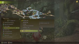
Let’s set the stage. You’ve just felled a towering Doshaguma after a 20-minute slugfest, your Palico cheering at your side as you revel in the thrill of the kill. Your inventory’s bursting with scales and claws, and it’s time to craft that shiny new armor set you’ve been eyeing. You hit the menu button, expecting a smooth dive into the crafting system that’s been a staple of Monster Hunter since the PSP days. Instead, you’re greeted by a labyrinth of tabs, sub-menus, and tiny text that feels like it’s mocking you from the screen. Want to compare weapon stats? That’s three layers deep. Need to tweak your loadout? Better hope you’ve got a spare hour to figure out where Capcom hid the option. This isn’t just a minor annoyance—it’s a design misstep that’s threatening to tarnish an otherwise stellar experience.
The beta’s reception on platforms like X and Steam forums paints a vivid picture of player discontent. “The hunts are incredible, but the menus make me want to throw my controller,” one user lamented. Another chimed in: “I’ve fought Anjanath blindfolded in World, but I can’t find my damn potions in Wilds.” Even the game’s diehard fans—those who’ve memorized every elemental weakness and item shortcut across multiple titles—are stumped. Capcom has long prided itself on a steep learning curve that rewards mastery, but this time, the challenge feels less like a satisfying grind and more like a punishment. The menus aren’t just clunky; they’re a chaotic mess of overlapping systems that seem to defy the polish fans expect from a series that’s sold over 100 million copies worldwide.
What’s gone wrong? For starters, Monster Hunter Wilds introduces a slew of new mechanics—dynamic crafting on the fly, weapon swapping mid-hunt, and an expanded item wheel—that demand a robust interface to tie them together. The game’s ambition is clear: it wants to be the most flexible, immersive entry yet, letting you adapt to sandstorms or monster ambushes without missing a beat. But the UI hasn’t kept pace. Take the item management screen: it’s a cluttered grid where icons blur together, and vital info like stack limits or crafting requirements is buried under layers of navigation. The radial menu, a lifeline for quick item use since Monster Hunter: World, now feels sluggish, with players reporting delays that throw off the rhythm of combat. And don’t get started on the forge—sorting through dozens of weapon trees feels like deciphering an ancient tome with no index.
How did I get here? (Image credit: Capcom)
Comparisons to past titles only deepen the sting. Monster Hunter: World, the 2018 juggernaut that brought the series to mainstream glory, streamlined its menus into something approachable yet deep. Sure, it wasn’t perfect—veterans still grumbled about the occasional fussiness—but it struck a balance that welcomed newcomers without alienating the old guard. Wilds, by contrast, feels like a step backward, as if Capcom took the feedback from World and Rise and decided to double down on complexity for complexity’s sake. One X user summed it up: “World taught me how to hunt. Wilds is teaching me how to hate menus.” It’s a sentiment echoed across the community, where even the game’s stunning visuals and buttery-smooth combat can’t fully offset the UI headache.
Could there be a silver lining? Some argue the menus reflect Wilds’ broader design philosophy: unapologetic depth. This is a game that doesn’t hold your hand—whether you’re tracking a monster through shifting dunes or juggling a dozen status effects, you’re expected to earn your victories. The menus, in theory, could be part of that ethos, a puzzle to master alongside the hunts themselves. But that argument falls flat when the execution feels so unintuitive. A steep learning curve is one thing; a poorly designed interface that wastes your time is another. Players aren’t asking for a dumbed-down experience—they just want a system that respects their effort instead of turning every trip to the smithy into a slog.

Capcom isn’t blind to the uproar. The beta, after all, exists to gather feedback, and the full release is still months away. Posts on X have already caught the eye of community managers, with some hinting that UI tweaks could be in the pipeline. “We’re listening,” one cryptic reply read, sparking cautious optimism among fans. History offers hope too—Monster Hunter: World launched with multiplayer hiccups that were patched into oblivion post-release, and Rise refined its systems based on player input. If Capcom can overhaul the menus by February—perhaps with clearer layouts, faster navigation, or a customizable HUD—Wilds might yet dodge this self-inflicted wound.
For now, though, the community’s split. On one hand, you’ve got hunters who shrug off the menus as a minor gripe, too enthralled by the game’s jaw-dropping scale to care. “I’ll fight through a thousand bad UIs for that Chatacabra takedown,” one Steam reviewer boasted. On the other, there’s a growing chorus of players who see the interface as a dealbreaker, a blemish on a game that’s otherwise poised to redefine the franchise. It’s a rare case where the monsters aren’t the biggest threat—your own gear screen is.
As Monster Hunter Wilds barrels toward its 2025 debut, the clock’s ticking for Capcom to sharpen more than just the weapons. The hunts are brutal, the world is breathtaking, and the potential is sky-high—but none of that matters if players can’t find their way through the chaos of the menus. This isn’t about dodging claws or landing combos; it’s about surviving the real endgame boss: a UI that’s as wild and untamed as the beasts it’s meant to help you conquer. Will Capcom slay this dragon before launch, or will hunters be left cursing their screens long after the credits roll? Only time—and a lot of feedback—will tell.
News

THE SCHOLAR EXPLOIT: How ‘Gift-Looping’ in Scholar Stone is Crashing the Rare Material Market
STOP HARVESTING. THE SCHOLARS ARE HOLDING THE REAL LOOT. 🧪💎 Tired of grinding for Brimstone, Mercury, and Rubber like a peasant? While most players are out breaking their backs in the fields, the pros have discovered a “Social Engineering” loophole…
THE PUPPET OF PYWEL: Players Uncover the 108-Cycle Multidimensional Nightmare of Crimson Desert
CLIFF IS NOT A HERO. HE IS A FAILED PUPPET IN A 108-CYCLE NIGHTMARE. 👁️🌑 Think the story of Crimson Desert is just another shallow RPG plot? You couldn’t be more wrong. The bone-chilling truth behind Cliff’s lifeless stare and…
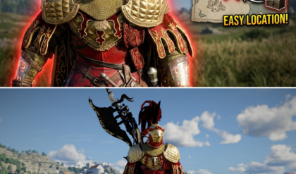
THE PYWEL ARMORY EXPOSED: Secret Vaults and ‘Trust Exploits’ are Redefining Crimson Desert’s Meta
YOUR ARMOR IS TRASH. HERE IS THE UPGRADE YOU NEVER KNEW EXISTED. 🛡️💀 Still running around in basic leather while the bosses in Pywel are laughing at you? Most players are missing the absolute best sets in Crimson Desert because…
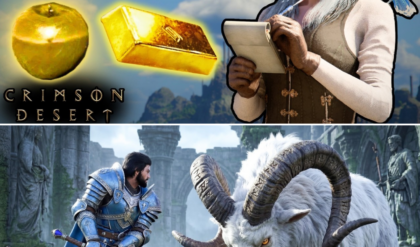
THE HAUNTING OF DEINIS: Players Uncover the ‘Cursed Soul’ Armor Hidden in Secret Underworld Vaults
THERE IS A SECRET BURIED BENEATH THE DEAD. AND IT’S PURE GOLD. ⚰️✨ Think the ruins of Demeniss are just empty stone and dust? Think again. The most elusive defensive set for Cliff isn’t sold by any merchant or dropped…
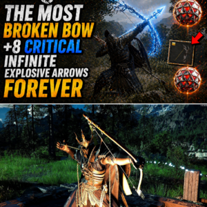
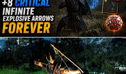
THE ‘EPHEMERAL’ REVOLUTION: How Infinite Explosive Builds are Breaking Crimson Desert’s Boss Encounters
ONE BOW TO RULE PYWEL. ZERO ARROWS REQUIRED. 🏹💥 Forget the standard meta. While everyone is chasing swords, the true elite are unlocking the Ephemeral Bow—the only ranged weapon in the game that scales directly with Critical Damage. But that’s…
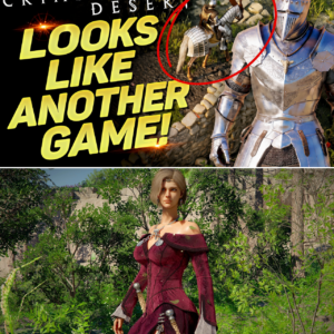
THE ‘DIABLO DESERT’ PHENOMENON: How a Simple Camera Hack is Redefining Crimson Desert’s Identity
CRIMSON DESERT OR DIABLO 4? YOU WON’T BELIEVE WHAT JUST HAPPENED. 🤯🕹️ Think you’ve seen everything Pywel has to offer? Think again. Players just discovered a “Secret View” that completely transforms the game into a top-down Diablo-style ARPG, and the…
End of content
No more pages to load