DC’s BIGGEST Gamble: Are the Lanterns losing their color? 🟢➡️🩶
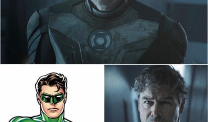
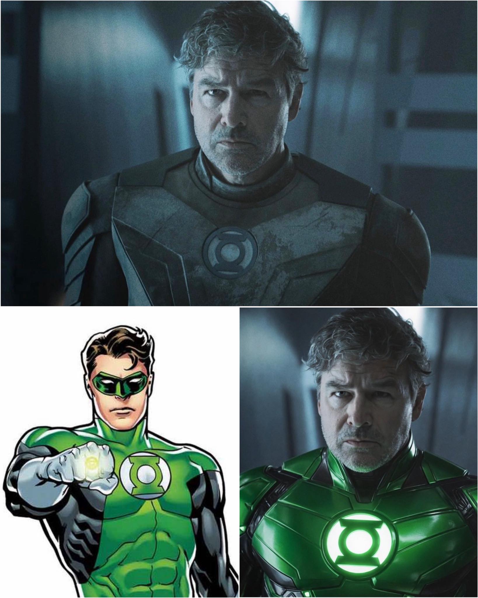
The wait for HBO Max’s Lanterns is finally over, but the first look at Kyle Chandler’s Hal Jordan has the entire DC fandom at war! Gone is the iconic, vibrant green armor we grew up with, replaced by something… different. A lot darker. A lot more “Gray.”
Is this the gritty, grounded take we were promised, or has DC completely lost the plot on its most colorful hero? The “Gray Lantern” memes are already flooding the internet, but there’s a massive theory about why the suit looks like this that might change everything.
Get the full breakdown on the costume controversy and the theory that has everyone talking here 👇
The Green Lantern Corps has always been defined by its brightness—a beacon of light in the darkest corners of the universe, powered by the vivid, emerald energy of willpower. Yet, as HBO Max pulls back the curtain on its highly anticipated Lanterns series, the most pressing question on fans’ minds isn’t about the plot—it’s about the color palette.
A Muted Arrival
The recent teaser trailer, which gave us our first extended look at Kyle Chandler as an older, seasoned Hal Jordan, has sparked a firestorm of debate. In the footage, the iconic Green Lantern armor appears significantly more muted, leaning into a slate blue-gray aesthetic rather than the eye-popping neon green synonymous with the DC Comics source material.
The reaction was near-instantaneous. Social media platforms, particularly X and the r/DC_Cinematic subreddit, were flooded with commentary. Critics of the design have playfully (and sometimes harshly) dubbed the series Gray Lantern, with many questioning why a franchise centered on the spectrum of light would opt for such a monochromatic visual identity.
The “Battle-Worn” Defense
However, the design choice has its defenders. Proponents argue that the aesthetic is a deliberate narrative decision, not a creative oversight. In this series, Hal Jordan is not the fresh-faced test pilot of his youth; he is a veteran, a man who has seen too much and fought too long.
“This isn’t a superhero origin story; it’s a noir detective story,” noted one production-focused analysis on Discord. “A battle-worn, grounded, tactile suit makes sense for someone operating in the gritty, boots-on-the-ground reality that HBO is building.” Fans are pointing to the “grounded” promise of the series as justification for the darker, more armored appearance—a suit designed for survival in the deep reaches of space rather than for parades on Oa.
A New Tonal Direction
The shift in costume design mirrors the broader shift in DC’s television strategy under the current leadership. Lanterns is widely expected to lean into a grounded, investigative procedural style—a “True Detective in space” approach. By pulling back the saturation of the iconic suit, the studio may be attempting to signal to audiences that this is a departure from the high-fantasy aesthetic of previous DC cinematic endeavors.
But does a “grounded” tone necessitate the loss of the color that gives the hero his name? The debate highlights a persistent tension in modern superhero adaptations: the push-and-pull between “realistic” design and the inherent, colorful spirit of comic book source material.
The Community Weighs In
The discussion has expanded beyond simple aesthetics to questions of franchise identity. Some fans argue that the “Gray” look is symptomatic of a larger issue where studios are afraid to embrace the “comic-booky” elements of their properties.
“It’s okay to have a green suit,” one top-rated comment on Reddit read. “We have the technology to make it look epic. Making it look like tactical military gear feels like they are embarrassed by the character’s roots.”
Conversely, others are asking for patience. With the series currently in post-production, many believe the final, color-corrected product—combined with the visual effects of the ring’s energy constructs—will bring that necessary “green” pop back to the screen.
The Path Ahead
Whether the design choice is a stroke of visual genius or a tonal misstep remains to be seen. HBO Max is betting heavily on Lanterns to anchor its DC slate, and the studio is clearly committed to a vision that prioritizes atmosphere and character weight over traditional superhero flair.
As the marketing campaign continues to roll out, DC will have to walk a fine line. They need to reassure fans that this is still the Green Lantern they know and love, even if it looks a little less green than expected. For now, the “Gray Lantern” debate remains the most prominent conversation in the DC space, proving that even a color palette shift can be enough to ignite a galaxy-sized debate.
News
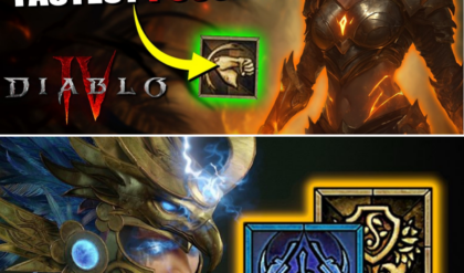
The “Illegal” Spiritborn: Why This Season 13 Meta Build Is Redefining Speed-Farming
BROKEN SPEED! 🏎️ This Spiritborn Build is “Illegal” in Season 13! Tired of slow, clunky builds? A new Spiritborn meta has emerged that’s so fast, players are calling it “illegal.” We’re talking infinite dashes, massive AOE, and a “spin-to-win” playstyle…

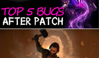
The Patch 3.0.3 Paradox: 5 Game-Breaking Exploits Still Ravaging Sanctuary
PATCH 3.0.3 FAILED! 😱 5 Broken Bugs Blizzard Can’t Fix! Think the devs finally balanced the game? Think again! The latest patch was a disaster—or a goldmine, depending on who you ask! We’ve uncovered 5 “broken” mechanics that are still…
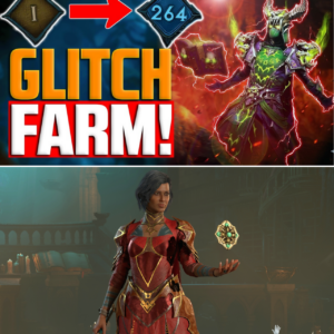
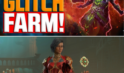
The “Forgotten Wisdom” Loop: Is Diablo 4’s New XP Exploit Ruining the Season 13 Grind?
BROKEN! 😱 This “Infinite XP” Glitch Is Getting Everyone to Paragon 300! The devs might patch this any second, but right now, players are abusing a secret “Nightmare Dungeon” loop to farm millions of XP every few minutes! Forget the…

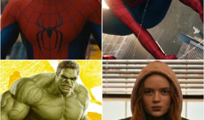
The Wall-Crawler’s Hardest Fight: Why ‘Brand New Day’ is Poised to Reshape the MCU
THE WEB-SLINGER IS BACK! 🕷️ Is this the most anticipated trailer of the decade? Everything changed after No Way Home, and Peter Parker’s new reality is looking darker, lonelier, and more dangerous than we ever imagined. While the world has…
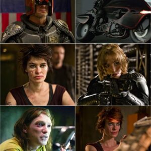
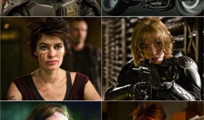
The Verdict is In: Why ‘Dredd’ Remains the Undisputed King of Cult Action
THE JUDGE IS BACK! 🚨 And he’s doing it for free! If you missed the most criminally underrated action movie of the century when it hit theaters, you have zero excuses now. Dredd (2012) is officially back, and starting TODAY,…
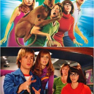
Scooby-Doo’s Second Life: How Netflix is Turning Nostalgia into a Mystery-Solving Empire
ZOINKS! The Mystery Inc. gang is BACK to reclaim their throne! 🐕🔎 They’ve been called “cult classics,” but we all know the truth: the 2000s Scooby-Doo movies were ahead of their time! With Matthew Lillard’s Shaggy finally returning to the…
End of content
No more pages to load